Explore More US Stock Portfolio Analyses →
This Newmont chart analysis dissects the daily (1D) momentum and ruthless risk management entry points for NEM, the premier gold mining mega-cap acting as Wall Street’s safe haven amidst stagflation fears. Welcome aboard as we cut through the market noise to navigate the deep currents of institutional capital and systemic algorithms.
“A merciless shower of profit-taking amidst a golden rally. Now is not the time to catch a falling knife with bare hands, but to raise your shield and wait for the downward wave to subside.” Despite the macroeconomic tailwinds of rising gold prices, the chart is mechanically warning us of short-term downward pressure.
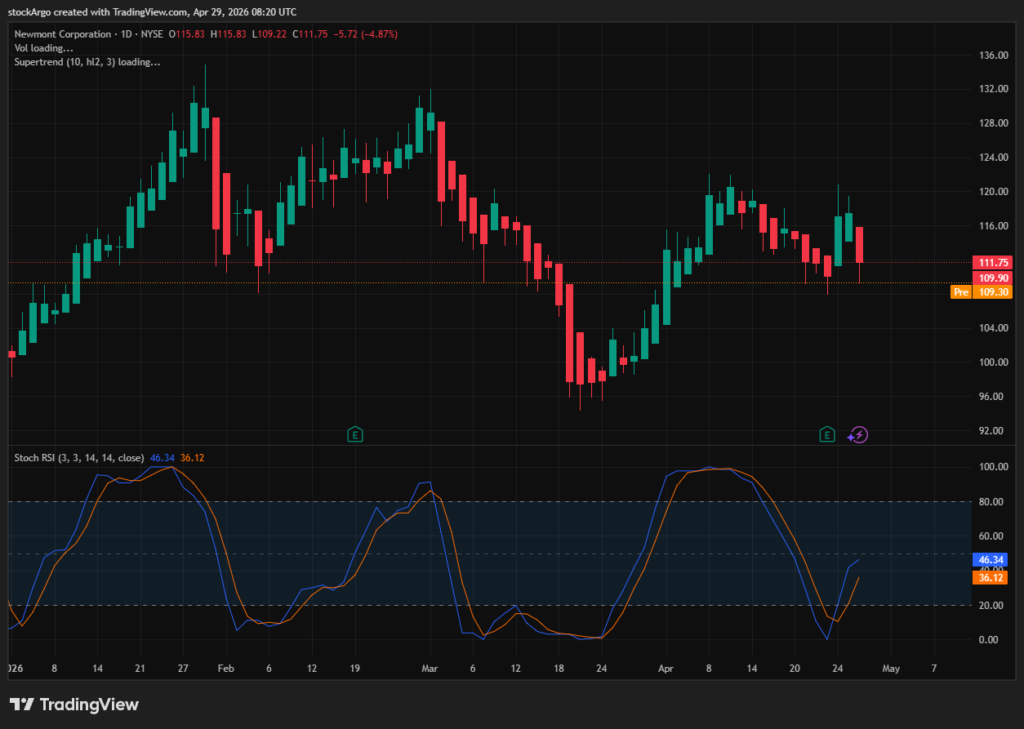
Our designated target for the [US Stock Portfolio] today is Newmont (Ticker: NEM). On the daily (1D) chart, NEM has entered a brutal price correction phase, plummeting -4.87% in a single day. Just as the stochastic indicator was attempting a rebound from the bottom, a wave of institutional profit-taking painted the chart deep red. No matter how robust the fundamentals are, when the chart points to a short-term correction, a true hunter must exercise absolute patience. Let’s dissect this sudden selling pressure and the critical support lines below using our three core system indicators.
⏱️ 3-Second Executive Summary (1D Analysis)
| System Core Indicator | Analysis Status (Fact Check) | StockArgo Strategy |
|---|---|---|
| Stoch RSI (Daily 1D / 3, 3, 14, 14) | Currently at 46.34 / 36.12. Attempted a golden cross from the bottom, but upward momentum is rapidly stalling due to heavy selling pressure. | ⚡ Wait and Observe Direction |
| Heikin Ashi (Daily 1D / Standard) | A massive red bearish candle has emerged, instantly breaking the bullish trend and signaling a strong downward momentum. | 🔴 Strictly Prohibit Premature Buys |
| SuperTrend (Daily 1D / 10, hl2, 3) | A firm Green (Buy) support line is established at $102.17, though there remains a significant gap from the current price. | 💎 Verify $102 Support Before Entry |
🚀 Strategic Conclusion: This is a classic “profit-taking plunge” that dumps cold water on a rising rally. The daily candle is radiating intense downward energy, making any premature bottom-fishing extremely dangerous. Discipline is key: wait patiently on the sidelines until the red Heikin Ashi wave completely stops and the price proves its resilience near the $102.17 SuperTrend support.
📰 Fundamentals: The Absolute Power of Gold in the Stagflation Era
For a successful Newmont chart analysis, one must understand why this company possesses such an unparalleled defensive moat during macroeconomic crises. To avoid being shaken out by short-term price drops, we must look at the structural backbone.
According to the latest Yahoo Finance NEM data and Wall Street macro reports, as fears of stagflation—where high interest rates and sticky inflation crush economic growth—intensify, the value of physical gold skyrockets. As the only gold mining giant listed in the S&P 500, Newmont enjoys a massive “operating leverage.” When gold prices rise, its mining margins expand exponentially. Even if the stock price undergoes a correction due to short-term speculative profit-taking, these overwhelming fundamentals serve as a sturdy pillar, guaranteeing a long-term upward trajectory.
🧭 Technical Newmont chart analysis: Testing Support Amidst a Downpour
When macroeconomic tailwinds clash with short-term chart dynamics, we must mechanically prioritize the chart’s signals. Our system indicators are currently flashing a “strong caution” sign on the NEM chart.
1. Heikin Ashi: The Ruthless Bombardment of the Red Wave
[System Setting: Daily 1D / Standard]
The most glaring feature on the current chart is the massive red bearish candle that drove the price down by -4.87% in a single day. This powerful downward momentum instantly trampled the beautiful green upward rally we had been enjoying. This solid red candle, lacking an upper wick, suggests that the selling pressure is far from over. Never reach out hastily until the first green bullish candle appears to pump the brakes.
2. Stoch RSI: The True Test of Upward Elasticity (46.34)
[System Setting: Daily 1D / 3, 3, 14, 14]
This is the most confusing indicator for hunters in today’s Newmont chart analysis. The indicator itself is maintaining a ‘golden cross’ status at 46.34 / 36.12, with the blue K-line positioned above the orange D-line. However, as the price plummeted, the upward angle of the indicator has rapidly flattened. This is a precarious zone: if it withstands the selling pressure and turns back up, it’s a perfect entry; but it also carries the lethal risk of forming a death cross and crashing back to the floor.
3. SuperTrend: The Final Defense Line at $102.17
[System Setting: Daily 1D / 10, hl2, 3]
The current price has retreated to the $111 level, and laid out like a thick carpet below it is the Green (Buy) SuperTrend support line at $102.17. Since there is a significant gap from the current price, we must remain open to the possibility that the price will slide further down to $102 for a deeper correction. Instead of executing blind market buys, the smart strategy is to wait and verify if this $102 line holds, then accumulate gradually using split entries.
💡 StockArgo Insight: A Predator Waits for the Trap to be Sprung
“Do not catch a falling knife with bare hands just because the fundamentals are flawless. A true trader quietly waits at the $102 support line for the smart money to wipe off the blood and turn the steering wheel around.”
The conclusion of today’s Newmont chart analysis is clear. As the ultimate stagflation defense stock, Newmont’s value is stellar, but today’s sharp -4% drop is a clear sign of whales taking short-term profits. While the Stochastic RSI has not entirely lost its upward trend, the downward pressure of the candles is overwhelming. Exercise extreme patience until the red Heikin Ashi wave stops and the $102.17 SuperTrend support proves its resilience. The moment the system confirms the brakes and shouts ‘GO’, we will board the gold train again from the safest possible bottom.
🔗 Related Analysis in US Stock Portfolio:
* Disclaimer: This post is based on market conditions as of April 29, 2026, and is strictly for educational and chart analysis purposes. It is not financial advice. Please do your own research (DYOR).
* Data Source: TradingView / Yahoo Finance